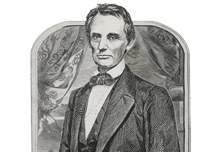
Michael Young
Dean
Associate Professor
Michael Young is an architect and educator practicing in New York City where he is a founding partner of the architectural design studio Young & Ayata. Young & Ayata have received the Progressive Architecture award, the Design Vanguard Award, the Young Architects Prize, and a first-place prize for the design of the Bauhaus Museum in Dessau, Germany. Their work has been exhibited at the Museum of Modern Art-New York, the Istanbul Modern, the Graham Foundation, SCI-Arc and Princeton University. Michael has published numerous essays and the books The Estranged Object (Graham Foundation, 2015) and Reality Modeled After Images (Routledge, 2021). He was the 2019-20 Rome Prize Fellow at the American Academy in Rome.
Michael earned his MArch II degree from Princeton University and his BArch from Cal Poly San Luis Obispo. He is a registered architect in the State of New York.
View Michael Young's CV here.
Projects
-
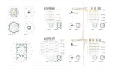
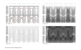
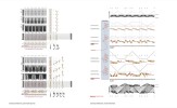
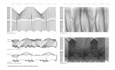
St. Ivo Variations
-

Bauhaus Museum Dessau
-

The Bosphorus Grove
-

The Guggenheim Helsinki
-
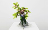
Base Flowers
-
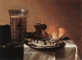
Still Life Interventions
-
Wall Reveal
-
DL 1310 Apartments
-
M.K. Čiurlionis Concert Centre
Back
St. Ivo Variations
Bauhaus Museum Dessau
Dessau, Germany
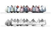
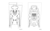
It would be a reduction of the complexity of the Bauhaus to divide it cleanly into a technical side and an expressive side, yet technical and expressive factors were often in conflict and in conversation throughout its history. The tension between these two motivations—and specifically the shape that tension took at the Bauhaus—continues to influence art, architecture, and design today. Our design of a museum for the Bauhaus Dessau is strongly informed by such productive tension—in this case, the tension between a desire for a modular repeatable system of organization, provided by a grid, and the exploration of sensation found in color and material experimentation.
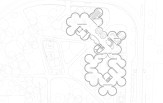
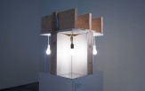
Our proposal for the Bauhaus Museum Dessau acknowledges these tensions through the design of a building as a collection of individual masses aggregated serially through a grid. We are calling these objects “vessels” as they allude to the crafted object of a vase or volumetric container. The vessels hover above the site on trunk-like legs, creating a light touch in the park and allowing passage underneath. The bellies of the vessels swell to touch each other creating an open continuous floor plan that connects the entire museum with a single floor. These combinations allow the building to fluctuate character between a huddle of singular objects, a sinuous coil of continuity, and a matrix of gridded repetition. Each attitude is at odds with the others, a productive tension resonating through the design.
The Bosphorus Grove
Istanbul, Turkey
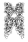
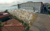
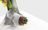
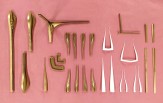
The Bosphorus Grove was designed for the 2015 MoMA Young Architects Program at the Istanbul Modern Museum. On first glance the arrangement of clusters of branching columns with petal like elements is reminiscent of a natural tree grove, but the elements are clearly not nature. This grove is somewhere between the mechanical and the biological as the tubes allude to cultural situations as diverse as auto machinery shops and medical treatment facilities. These elements are symmetrical in plan, but where the traditional tree grove is ordered on the planted ground with the tree canopy taking on natural asymmetries above, The Bosphorus Grove is symmetrical above and informally asymmetrical on the ground. The ground organization is created through the all-over meandering movement of garden hoses across the site, a hose garden if you will. The construction is made from common industrial building materials; concrete cast in steel pipe, steel rebar structure, fiber braided hose, and zip-tie attachments. But, when assembled these material create a completely different aesthetic than their typical pragmatic associations. The drooping field of hoses combined with the sheen and flicker of light off their transparent woven surfaces produces an atmospheric effect of increased air density towards aqueous qualities. These hoses also literally hold water up to a certain level, or as it should be said, the water in the hoses becomes the weight that anchors the grove to the ground and stabilizes the petal canopy’s physical desire to flutter in the air.
Sustainability is in many ways a speculation on the future of building materials and assemblies. Most buildings are torn apart, broken down, and buried as waste in land-fills. The Bosphorus Grove pavilion is reused in its entirety. The trees are cut from their concrete bases and flipped over to be placed in a new arrangement as a fish habitat. The concrete bases now serve as anchors for the underwater structures. The surfaces of the hoses no longer scatter light reflections but now become attractors for algae and the encrustation of water life that flows through the Bosphorus. As marine life accrues over time, the hoses become closer to geological/biological material transforming the hovering cloud like atmosphere of the above ground pavilion towards artificial underwater rocks.
The Guggenheim Helsinki
Helsinki, Finland
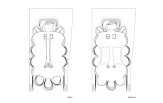
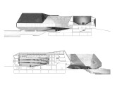
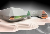
The exterior mass of the Guggenheim Helsinki proposal is a collection of objects. These objects have a simple plan geometry that transforms from a pure circle to a pure square. But in elevation these geometries are secondary to the strange figuration that occurs. Pragmatically the downward protrusions are structure, the upward protrusions are light scoops, but the aesthetics of the figures are unstable. These objects are either all heads with horns, or all headless bodies with odd truncated limbs, or all body-less butts, butted up against each other. The collected building figuration is formed through 14 similar but unique figures huddled together. The structural legs meet the site in a completely symmetrical organization, thus the moment of the most disparate fragmentation is held together by a collective rational. As the figures rise up to congeal into the main gallery floor, each figure begins to wiggle disturbing the overall symmetry while becoming side gallery spaces.
Entry takes place through the legs and under the belly of the collected mass in an open court similar to a shipyard drydock. A material transformation occurs on the figure’s surfaces as one walks under the building. The concrete structure is clad in recycled wood in various stages of decay collected from across the country of Finland. The exterior of the building is thus under constant renovation and transformation. This deteriorating material is applied in an ornamental pattern creating a tension between the form’s geometry and their sensuous qualities along the edges the pattern draws relations between the different figures, but by the time these motifs reach the underbelly they are almost symmetrical again, alluding inappropriately in a major cultural institution. The museum may collect, preserve and display art, but this design proposes an external presence as a collection of objects which in turn collect, reuse and display the material reality of rotting wood.
Base Flowers
Volume Gallery | Chicago, IL
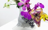
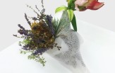
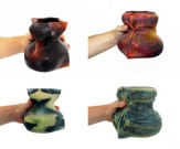
There is a conflict in the aesthetics of the cut flower. It is a living thing purposely severed and put on display through the abstraction of a vase. A flower vase has three primary objectives. The first is to hold water suspending the flower’s death. The second, to position or pose the flower in a particular gesture. And lastly, to disappear, allowing the flower to be the prime figural focus. Considering this combination, a vase is actually closer to a support system or a base that sinks into the background.
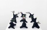
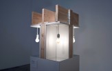
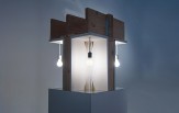
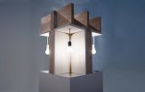
The vases/bases developed for Base Flowers are a combination of five vase positions in one. The base can be arranged in multiple orientations to privilege one vase over another. The different positions have different character allusions that attempt to animate the neutrality of a common vase by bringing attention to the qualities of the vase itself.
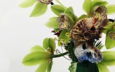
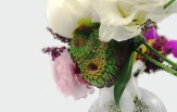
This odd inversion of a vase which attracts more attention than the object displayed offered an opportunity to experiment with the flowers themselves. Base Flowers also developed five new flowers designed as mutant species somewhere between the floral, biological, geological and digital. These new flowers are primitive specimens, both in their aesthetics as a well as their digital origin. As such, they are not attempts to mimic any existing flower, but are instead the “base” flowers for an alternate understanding of floral aesthetics. The cut flower in a vase is an artificial construct, an abstracted fragment of nature, severed, re-contextualized, and posed for aesthetic contemplation.
Still Life Interventions
Team: Emmanuel Osorno
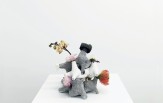
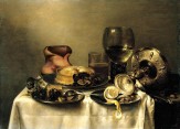
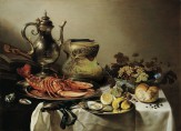
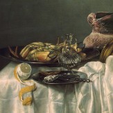
The realism of the objects as things in the world is further explored through a project in rendering and photocomposition. Each of the Donkey & Feather objects are inserted into different 17th CenturyDutch Still Life paintings. These explorations are efforts to explore the aesthetics of realism for the objects in a different context. Still life paintings are incredible efforts to develop the techniques of painting in the description of reality. They are also fantastic examples of estrangement in realism. The everyday, the overlooked objects of our world enter into relations with each other that resists the narrative interpretations of poetic panting, and even further resists the intrusion of the human into the representation. These are the relations between objects themselves, aesthetic relations of color, texture, materiality, luminosity, and reflectivity. Rarely are the objects in a still life left alone. They are broken, tipped, peeled, overturned, and cut to reveal all the strangeness that exists in the everyday world. The new objects become subtle intrusions into this realism. They seek to blend in, but not to hide. They are adjusted through rendering and photo-compositing to address issues of color, light, texture and reflection. They are reflected into objects in the scene as they also take on associations within themselves of the existing context. When the realism is successful they new objects are accepted as part of the original scene, as if the painting took 350 years to complete. The strangest qualities emerge when it is not the new objects that look weird, but the context that existed previously. The estrangement of context is a crucial aspect of realism, where a shift allows one to see the familiar in new terms. This defamiliarization is an aesthetic experience tied to the Parafictional artwork.
Still life with lobster, silver jug, large Berkenmeyer fruit bowl, violin, books and sinew sack object after Pieter Claesz, 1641 - 2014
Still life with herring and hot stone object after Pieter Claesz, 1636 - 2014
Still life with lemon, goblet and geological rub object after Williem Claesz, 1646 - 2014
Breakfast with a crab and a fuzzy rot object after Willem Claesz Heda, 1648 - 2014
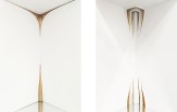
Wall Reveal
SCI-Arc Gallery | Los Angeles, CA
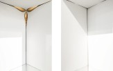
One of the most common details of contemporary architecture is barely visible, just a shadow. The gypsum board reveal has become the default detail to resolve the joint between walls, floors, ceilings, and apertures. It is pragmatic when providing an hard edge to finish the gypsum board and modern in its removal of decorative baseboards, moldings and trim pieces that conceal construction in more traditional architecture. But, the reveal also does something else aesthetically, it hyper-realizes the abstraction of the modern wall. The shadow line of the reveal produces walls that appear to float without any evidence of thickness or assembly. Walls as immaterial planes.
It is into these typical reveal details that we have jacked four different interventions. These intrusions disturb the assumed background of the modern abstract wall. With minimal modifications only on the reveals, it is no longer clear where a corner is, how thick a wall is, or what plane is in front of the other. The aesthetic effect is to defamiliarize the wall itself.
The construction also opens an estrangement of scale relations. From afar the piece appears as a fragment of typical construction. Up close, inside the gypsum board spaces, the appearance is of a finished interior with small scale details. It is at the middle distance between these two extremes that an unstable relation to scale becomes aesthetically triggered. The gap between the two scales is hard to maintain simultaneously making certain elements take on the abstract qualities of a scale model while other elements flip towards appearing too large. All this occurs even though every part of the construction is full scale. The wall becomes revealed as the abstract decoration that it is in reality.
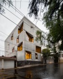
DL 1310 Apartments
Mexico City, Mexico | 2015 – 2020
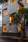
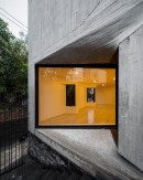
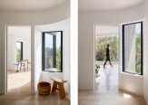
The DL1310 project is a mid-market residential building in Mexico City, consisting of seven 1 & 2-bedroom apartments. It was decided early on that the construction system would be the one most common to the region for this building type: load bearing cast-in place-concrete. It was also evident from the budget and the market that the unit types would be simple and straightforward in their plan layouts. A variance in the code allowed an extra floor if the building was set back from the lot lines on both sides, which also opened the side elevations for apertures. With the constraints of construction, planning, and massing set, design attention shifted to the windows. Given that these opening could not encroach the setback limits, the windows push and pull into the building as opposed to protruding. As the windows rotate into the building’s facade, ruled surfaces result at the head and sill, the floor slab edge thickening and thinning along the elevation. At times, the building’s enclosure appears extremely thick, at others, razor thin along a knife’s edge. These appearances also change at different times of day as the dark reflectivity of the glazing gives way to a more crystalline transparency at night. The result is a facade that is both blunt in its flatness, yet also dynamic as a bas-relief play of undulating shadows. The design process for the ruled surfaces was guided by both iterative digital models and research into the history of cast concrete ruled surfaces in the architecture of Latin America. Several full-scale mock-ups allowed us to find a tectonic articulation of board formed concrete as an integral expression of the aperture concept. The final methodology used traditional concrete construction techniques combined with re-usable fiberglass casting modules to produce an expression of both the casting as material process, and the visual perception of the movement of lines inscribed in the surface as decoration.
M.K. Čiurlionis Concert Centre
Kaunas, Lithuania | 2017
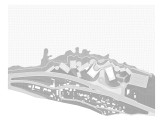
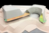
The M.K. Čiurlionis Concert Centre competition brief set an agenda that was both speculative to future developments and respectful to the history of the local culture. This duality continued in the requirement for two performance halls: one traditionally balanced in its acoustics and display, the other for experimental reconfigurations. The site also contains a conflict as the building is located on the industrial side of the river—near concrete plants, warehouses, and factories—yet is across the Nemunas river and clearly connected to the UNESCO historic city of Kaunas. These dualities reflect the conflicting desires occurring within many complex building projects and provided the background for our proposal.
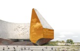
Our design attempts to activate these tensions by splitting the project into a series of doubles. At one level, it is literally two buildings, one for each performance space. It also has two radically different visual presences; one for the industrial street and one for the picturesque river views. The exterior is clad in two differing materials that invert from roof to wall between the two buildings. One material is reclaimed slate tiles patina through the processes of time, the other is a cast concrete, artificially imprinted with a rough stone grain. These material expressions are applied throughout the mass flipping from roof to base at the moment the buildings touch. These appear as solid objects from the industrial road, however, on the river side the solidity is sliced by planes of glass that transform the chunky masses into abstract figures of indeterminate scale and material. These windows are a highly reflective dichroic glass, creating iconic reflective figures during the day and floating apparitions of light by night. The sharp cuts transform the aesthetics of the solid material mass, a technique influenced by the sculpture of Ken Price and Isamu Noguchi, an aesthetic conflict between raw physical materiality and the ephemerality of a flat abstract image.

