Real World Pedagogy: Building in Shenzhen, China
POSTED ON: February 1, 2018
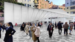
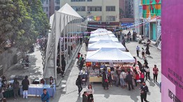
Margaux Wheelock-Shew, a fifth-year student in The Irwin S. Chanin School of Architecture, along with Cheung Lun Jeremy Son, in his third year, have just recently seen their first real-world work of architecture built in the city of Shenzhen, China for its 2017 Bi-City Biennale of Urbanism/Architecture. The two were co-designers, along with Nader Tehrani, dean of the school and principle designer at NADAAA, on a pavilion constructed outside the entrance to the exhibition's main building in a highly unusual collaboration by two students on a permanently built work in a major city. Though it didn't start out that way.
"It was crazy," Margaux says of the experience. "Yah. Crazy," Jeremy concurs.
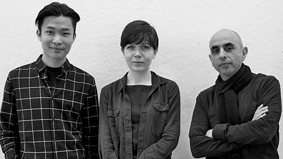
In the Spring of 2017 Dean Tehrani, sent an open call to all students to apply as interns to work at NADAAA during the Summer on a project for the Biennale in Shenzhen. "This particular project came to us and it seemed like a good opportunity to include students," Tehrani says. "Integrating work experience into the pedagogy is a goal of mine, especially if student participation is instrumental to the thinking and evolution of the work. The scope of this project, however, was unexpected. Margaux and Jeremey proved themselves up to the task with exceptional skill."
"I thought it was more of an exhibition since Nader didn't specifically mention a pavilion in the email," Margaux says. "A lot of times at these biennales there is a lot of paper architecture, which is still fun and interesting." Jeremy recalls thinking it was, "more like research and understanding of the area. When we got to Shenzhen we found out it was to be an outdoor pavilion."
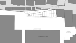
Shenzhen, located on the South East Chinese coast, has been a major manufacturing center for decades but more recently has been transitioning into a high-tech and banking hub. The Bi-City Biennale of Urbanism/Architecture, founded in 2005 in partnership with Hong Kong, is "the only exhibition in the world to explore issues of urbanization," according to the Biennial Foundation. This year's exhibition is located in Nantou Old Town, one of several historical "urban villages" enveloped by the city. The design team visited the site for two days where they found out the curators wanted a space for performance and gathering opposite the entrance to the main exhibition building.
Jeremy grew up in Hong Kong, not far from Shenzhen. But for Margaux, originally from Washington D.C., "it was my first time in Asia," she says with a look of disbelief when recalling her brief visit. "We were going to these factories and warehouses with CNC robots where they were like, 'Here's what we can do.' They showed us samples of all the material possibilities of they can do because everything is pretty inexpensive over there. A lot of it was based on 'How are you going to build this thing?' which became the key question. It was such a restricted site. It's an old part of the city, with people's houses and narrow passageways. So, we had to consider the size of the truck and how much it can carry. It had to be a thing that was prefabricated and assembled on site."
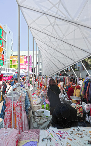
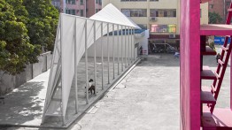
The curators of the Biennale wanted a showpiece because it would be a key installation at the opening on December 12, 2017. But the budget was small for a fairly large (20 meters) intervention. A wall at the back forms a boundary between the urban village and the larger city. The designers decided they wanted to create a dialogue with the wall and the pavilion. The pavilion would be higher than the wall, so they had to consider allowing sun to pass through to the homes on the other side. They wanted something "airy" that would bring in the existing urban environment and make it modern, reflecting the in-between zone of the old and new that is Shenzhen. Lastly they considered how to minimize the environmental impact of its dismantling, a common inevitability for structures designed for such festivals. They had no idea what its ultimate fate might be.
"We worked collaboratively, effectively discussing strategies that would then be developed through independent schemes of sorts" Tehrani says of his relationship with Margaux and Jeremy. Margaux describes the process: “We started with a few basic schemes pencil sketched by Nader. There was a lot of latitude there so we went through probably twenty or thirty iterations a week, working together to revise and refine our ideas as a design team."
Eventually they boiled it down to two central ideas. The students would create AutoCAD files and share them with Thornton Tomasetti, the structural engineering firm, during teleconferences that examined structure and cost implications of the submitted files in real time, an extremely rare opportunity for interns. "We were terrified that if they found out our age they would never talk to us again," Margaux admits. "But Nader trusted us enough that at some point he would just leave our meetings with them and later he would ask, 'Did you guys figure everything out?' So, he gave us a huge level of responsibility that was sometimes incredibly stressful but it was nice to have had that.”
"The engineers were really helpful in understanding our design concept and intent," Jeremy adds. "They worked to make sure we kept the design intent while trying to work out what can be done to make it possible. It was a contrast to how we had always heard jokes about how architects and engineers can't work well together."
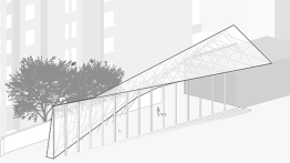
After several weeks and multiple moments of "despair" the team came up with a design based on a system of jointed steel pipe scaffolding supporting a canopy. A series of frames, each with their own geometry, could be built off-site, trucked in and constructed by connecting them along longer rods like, "an elegant shish-kabob." The canopy, made of diaphanous, but water-proof, material forms a thin isosceles triangle pointed up at one end and torques along the horizontal plane, flattening out, like someone twisting a flexible ruler. "The final version is nice because it was really our design. This form with the triangle lofting into the other shape was one we had come up with maybe in the first four weeks or so, but a very different version of it."
At the end of August, the designers sent Chinese curators a construction document (CD) set for final review and approval. Then the team went back to school. They heard nothing until the second week of the Fall semester. The message: the contractors needed a completed CD set translated into simplified Chinese and they needed it in 36 hours or else it could not be built. "It was like a 24-hour charrette," recalls Jeremy, who speaks Cantonese. "It was my first time translating architectural terms from English to Chinese. Plus, being from Hong Kong, I am more familiar with traditional characters than the simplified ones they requested."
The next big surprise: somebody over there decided it should be permanent, though it had originally been designed to be dismantled. So, the Chinese welded the joints and sank it into concrete. There is some irony to this because of all the designs the team came up with, the one they meant to be impermanent was the one with the scaffolding. "That thing is not going anywhere," Margaux says. Tehrani added: "Moreover, it is an important recognition that such initiatives can be in service of a larger civic mission that contributes back to the community in which it is lodged."
The students are grateful for the experience and the way it has informed their understanding of the practice of architecture. "In school your client is yourself," Jeremy says. "You want it to be a certain way and you do it. You get feedback and crits but you don't have to take them. It's your work. You own it. But in the real world there is a lot of different factors that have to be considered. This summer was a really great lesson in that."
"It's definitely good to have worked on something and try to troubleshoot it while you are designing it," Margaux says. "That allows you to be more comfortable with changing your design as you go through the process. It's not like school where you get to a certain point and then everyone gives you the "all clear." This helps you to remediate something that was clear to you at the beginning. At the end you learn there are some things you really want to fight for and some things you care less about.

