Time Constraints: The Challenge of Teaching Design in Four Weeks
POSTED ON: March 7, 2017
This blog post wouldn’t exist without a deadline. I don’t think most things in life—and especially not in the arts—would exist without some sort of time constraint. As a full-time type designer, I understand this well. Every type designer I know understands that typefaces are never finished, they are just released. Meaning that, if I don’t have a deadline, either self-imposed or by a client, I could literally draw, test, and refine a typeface for the rest of my life, and die with a huge smile on my face.
However, the reality is that deadlines are a part of life, and they can be immensely helpful to the design process. I enjoy the challenge of a tight deadline. It forces me to act on instinct and find inventive solutions to complex problems. Time is a design constraint, and embracing this constraint can be a powerful tool for learning and personal growth.
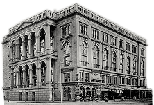
Never has this been more apparent to me than last summer, when I faced one of the biggest design challenges of my career: teaching Graphic Design at Cooper Union’s Summer Art Intensive, a rigorous four-week program that prepares high school students to apply to top art schools.
While designing my syllabus for the program, I made a list of things that were essential to a designer’s education. Then, I narrowed it down to what could be most helpful to pre-college students. The list was still long, and condensing such expansive topics as Design Principles, Lettering & Typography, Color Theory, and Design History into three hour chunks would be too overwhelming and not enjoyable for any of us.
Like many designers, I often turn to Charles Eames for advice. Eames, an influential American designer, once said the solution to solving a design problem rests in “the ability of the designer to recognize as many of the constraints as possible” and, crucially, the designer’s “willingness and enthusiasm for working within these constraints.”
Eames’ quote described my teaching challenge perfectly. My students were a group of highly motivated and enthusiastic high schoolers who were choosing to spend their summer in school. And, on top of design, they would also be taking classes in creative writing and drawing. With that in mind, I designed the syllabus with a simple premise: each class would present a challenge that used time as a design constraint.
Using this approach, I was able to introduce my students to the principles of design, and give them a strong foundation that would help them approach problem-solving like a designer.
During the first half of the program, we focused on tools and ideas. We covered 2D Design basics and Graphic Design history by visually deconstructing famous works of graphic design. To help them situate their work into a broader context, I took them for a special visit to the archives at the Herb Lubalin Study Center of Design and Typography at Cooper Union. During this visit, the curator, Alexander Tochilovsky, discussed how we can gain a deeper understanding of graphic design history by studying design objects.
We also covered Typography through lettering exercises that enabled them to see the details that make a typeface unique, as well as how those details determine the color, texture, and optimal use of a typeface. I also introduced them to Illustrator, Photoshop, and InDesign, and showed them how to use these tools efficiently.
I was afraid that some of the lessons would be too technical, but those fears quickly went away during class critiques. When the students themselves started pointing out the weaknesses in their designs, I’d helped them bridge the gap of identifying a problem and figuring out how to solve it. After a lot of trial and error, they were starting to see.
During the final half, we put these tools and ideas into action by focusing on the execution of short and long-term projects. I encouraged my students to work on these projects using both digital and analog tools. Getting them used to tight deadlines and short class critiques earlier in the program enabled them to move past their first drafts. By iterating and learning from each other, they were starting to see for themselves that design is the kind of challenge that is never finished, just released.
Their final project was to create a poster that clearly communicated their views on a topic they were passionate about. They created powerful images that explored the subjects as well as themselves, bringing to life a diverse array of themes including animal rights, film history, and feminism, to name a few. Throughout the project, we had many one-on-one conversations about their process, choices, and doubts. This culminated with the visit of a guest critic, where they had the opportunity to present their work, explain their process, and defend their choices in a safe and controlled environment.
At the end of the summer program, we had an exhibit that showed each student’s final project, as well as two group posters showcasing their best assignments from a class exercise. I was very impressed by the amount of work produced and the improvement that my students were able to achieve in just four weeks. It definitely helps having a good TA with you in the trenches—thank you Kelsey!
As the students printed their final project for the exhibit, I realized that I had met my deadline, and the summer program was rapidly coming to an end. All that was left to do was hang the exhibit and hope that I get lucky enough to do this again sometime.
Juan Villanueva is a Type Designer at Monotype, an instructor for the Pre-college Program at the Cooper Union, and adjunct faculty at The City College of New York, and a graduate of the 2013-2014 Type@Cooper Extended Program.


