Yun Gao A'23 Places First in Design Competition
POSTED ON: July 22, 2025

Screenshot from Yun Gao's award-winning info graphic

Screenshot from Yun Gao's award-winning info graphic
A Cooper alumna won first place in Print magazine's annual design competition in the student data visualization category. The project, called Donald's Twitter Wonderland (DTW), charts Donald Trump's Twitter feed from his inauguration in 2016 until the company, now known as X, closed his account.
Yun Gao began the project while a student in Beverly Joel's Graphic Design 2 class and continued to develop it in Barbara Glauber's open studio.
“In 2020, college was tough—doing college at home was even tougher. I ended up doom-scrolling a lot just to escape reality,” Gao says. But she soon discovered that the internet afforded little relief, especially when she tried to get accurate information about COVID but was instead confronted by anti-Asian slurs and misleading data about the pandemic.
“At some point, I wondered how long Mr. Trump’s nose would be if he were Pinocchio.”
After Professor Joel assigned students to design an infographic project, Gao made the first iteration of DTW, a tabloid-sized flyer. “Looking back, I’m still not completely happy with how it turned out... I was still figuring out how to work with type, space, and color.”
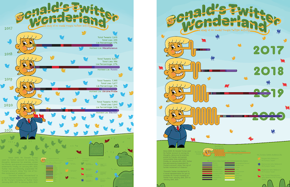
Returning to school in 2022, she decided to revisit the project. “This time, I wasn’t limited by an assignment prompt. I wanted to make something out of the box that physically showed the scale of Mr. Trump’s misleading tweets. So I stretched the final piece into a 96-inch-long accordion book. No more percentage bars—every tweet got a real, measurable length and stacked chronologically. The reader can actually use the book band as a ruler to measure and understand the data however they like.”

Gao used The Washington Post's Fact Checker, a column that assesses the veracity of news stories, to download all of Trump’s misleading claims that were tagged with “Twitter” as the source, along with their associated topic tags. She then cross-referenced that with the Trump Twitter Archive—an API (Application Programming Interface) containing all tweets from his account, including those flagged since November 2020. All the tweets were imported into Microsoft Excel for analysis—organized by month, counted, and color-coded by topic.
When President Trump was re-elected, she decided to bring the project online. She cleaned up the data further, breaking entries down by date and number of retweets. That process, she says, “gave me a much better understanding of the dataset—even two years later.” She likes the way that the digital version gives far greater flexibility so that viewers can click, hover, or scroll through the data to reveal additional information. “I also made the typography more dynamic, with better size contrast, and even added a third typeface to break up the body text and make it easier to read.”
DTW has been recognized by 50501, the Information is Beautiful Awards, the Data Visualization Society, Buena Vista Data Club, and now the 2025 PRINT Awards.
“Although it’s been a journey, the heart of Donald’s Twitter Wonderland has always been a peaceful protest—advocating for movement against misinformation and baseless conspiracy theories.”