Adriana Farmiga Named Assistant Dean
POSTED ON: October 3, 2017

Adriana Farmiga. Photo by Tia Jeung<br><br>
 at Marisa Newman Projects. Image courtesy Marisa Newman Projects")
Adriana Farmiga's "Blue Hour" (installation) at Marisa Newman Projects. Image courtesy Marisa Newman Projects
Adriana Farmiga A’96, who has taught at the School of Art since 2011, has been appointed Assistant Dean at the school. Farmiga is undaunted by the prospect. To her, this new role is just, “one more moment to be able to focus my efforts and demonstrate my enthusiasm for our community.”
“The first day of every semester I tell each group of students…that we are our own community. It’s this community that has supported us in unique and complex ways over the last ten years. Our dedication to the common good and the community of the School of Art is the good citizenship of Peter Cooper, and it starts day one in the classroom.”
For Mike Essl, acting dean, Adriana is a perfect partner. “Adriana is an invaluable resource. Her deep involvement and familiarity with the school, dedication to our students, and of course her incredible work as an artist made her the obvious choice for the job. She literally doubles my efforts as a dean.”
As well as teaching, Farmiga is a working artist. She got her MFA from Bard College in 2004, and has shown in group and solo exhibitions in the United States and abroad. Her work has been reviewed in the New York Times and Artforum among other publications, and ranges from conceptual still life to video and mixed media sculpture.
Adriana Farmiga’s latest work is on view in a solo show titled “Blue Hour" at Marisa Newman Projects until October 7. As part of that work she had a conversation with fellow artist Fawn Krieger, a sculptor and adjunct faculty member at Adelphi University, exclusively featured below. In it, the new assistant dean talks about her artwork and the work being done at the School of Art.
Composting with Adriana Farmiga
An interview by Fawn Krieger
September 2017
Fawn Krieger: Your exhibition, "Blue Hour," currently up at Marisa Newman Projects includes an extensive archive of compact gradient paintings, each made in sets of 2, and a large central wooden construction reminiscent of a road construction barrier. Could you speak a bit about this recent body of work, its installation, and the impetus behind it?
Adriana Farmiga: I was approached to consider a special project by the gallery; to create a dedicated installation or body of work that runs parallel to my studio practice, but is seemingly also anachronistic to something I might otherwise produce for a standard gallery exhibition. (In thinking about what this could be, I realized there were a few components in my recent work that were ready for closer scrutiny. Over the last few four years, my drawings - best described as conceptual still lifes - have shifted to include color gradients in the background. These gradients pay homage to the Japanese printing method known as "Bokashi." I decided I wanted to isolate what was essentially background/support, and address it directly as subject matter. This is where the premise for Blue Hour started.
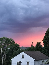 "Blue Hour" refers to the transitional moment of dawn or dusk (usually marked by a dark blue but the colors can vary depending on weather and geography), when it is neither night nor day. As an isolated phenomenon, this is fascinating, because when pulled out of context (am, pm), it's often unclear which is which. This hits at the core of concerns about where we are in terms of: relationships with each other, within communities and globally. As we move into increasingly polarized times, the capacity to understand difference and negotiate difficulty has been sabotaged by fear, the impulse towards position-taking and labels, and a lack of nuance. I wanted to address this.
Although the moment of a sunrise or sunset represents beginning and end, when extracted from this, it's actually a very fluid thing, where liminality is established -- through color, value and tone. The work is presented as a series of diptychs, pairs of sunrises and sunsets, many observed from life and equally as many sourced from online searches (thank you hashtags). I spent the summer attached to a notebook that registered color menus of each sunrise and each sunset I was able to witness.
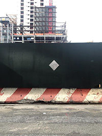
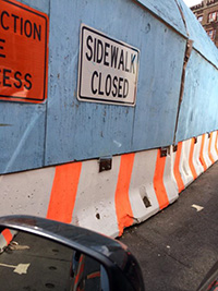
When thinking about how to install this work, I considered the basic architecture of the space, and how east (sunrise) could separate from west (sunset). To represent this and still keep the diptychs together (rather than separate them according to east and west), I designed a sculpture to sit centrally in the gallery's space: a freestanding maple-plywood form, based on the proportions of a Jersey Barrier - those ubiquitous cast concrete road dividers - and calling to reference the typical urban (NYC) construction barriers. These makeshift walls usually feature a geometric cut-out to allow for viewing beyond the line of access; in my case I chose circles. With the sculpture, the viewer is free to move around the work, with the circular windows acting as portholes through which the surrounding skies are visible. Together, the sculpture and paintings aim to advocate for the labor of considered complexity, for positions and states that don't readily reduce into single categories or simplification.
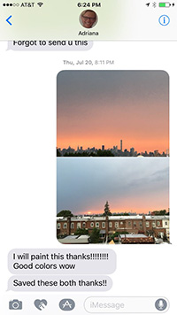 FK: A couple months ago, while you were preparing for the show and you had mentioned your idea of the gradient paintings to me, I sent you some photos of a summer sunset from my bedroom window. You thanked me and said you would paint it. Typically, when we document a sunrise or sunset we take a horizontal photograph. You’ve chosen to depict your gradients on vertical substrates. Given your interest in borrowing blue hour images from friends, I’m curious how or if these works function equally as portraits, in addition to landscapes (or as you often reference of your work, still lifes).
AF: Well keeping in tone with the idea of liminality and the in-between-ness of things, these gradients present both landscape and portrait. Each day and its events are marked with a distinct personality, as a basic starting point. And if I’m talking about all things interstitial, we can start to pair value (color) to values (people). Definitions of identity easily puzzle into place, too. So these were a few reasons why having the paintings maintain a portrait format was important to me, since as you say, we usually snap photos of a sunrise or sunset with a wider angle. Additionally, as someone who also has a vigilant swimming practice, it felt appropriate to have these pieces exist as pools of color on the wall, something you can dive into. Plus, they read better as vertical compositions on a mobile device – something that became a tool for my recording the compendium of blue hour images I was looking for and collecting. By the way, I’m enjoying the amount of enthusiasm I showed you for your images over text. As the summer progressed, I was getting inundated with similar color postcard texts from people on a daily basis, ranging as far as Japan. The latter was a nice psychic connection to my consideration of Bokashi as a spirit guide for the gradients. I should mention that each pair’s terminal color(s) would start the subsequent painting, sort of as a challenge to keep true to the modern definition of Bokashi in Japanese, which means “to compost.”
FK: I too was impressed by the amount of exclamation points you used!!!! It felt very un-Adriana, or Adriana EXTREMELY excited. I like the idea of thinking about compost as a means to begin a conversation or a way of looking where previously one left off. How does your idea of compost expand into other formats of thinking and processing— what are you reading and looking at to inspire and inform this body of work?
 AF: I’ve been reading a broad range of texts that are attempting to parse through the inflamed social landscape we find ourselves in after last fall’s election, but what’s gotten my full attention has been Sarah Schulman’s Conflict Is Not Abuse. As a teacher, I see how energy has shifted away from nuance and towards over-simplification. If left unchecked, this doesn’t make for strong artists, as much as it doesn’t make for healthy citizenship in our country. Reality TV has pretty much ruined the executive office as well as art school critique; everything’s a contest for likes now. (Although I’m partial and will say that at Cooper Union we do a pretty good job to avoid this happening to our students.) Schulman is a professor too, and uses many examples from her classroom experiences to frame out an argument for sticking through the difficult moments to problem solve instead of retreating behind fear of difference. It’s not an easy read because it asks us to consider our own roles in conflict, and to be open to self-scrutiny. The understanding that there are a range of histories, experiences and points of view is very tied into the idea behind this work. Plus, the cover has a gradient.
FK: What does in-between look like to you? Is it a place of uncertainty, a stable foundation, a reservoir of possibility, etc? You mentioned to me recently that as a kid you used to read ‘choose your own adventure’ books. I was always frustrated with those books because they were perpetually un-ending and I would want to see each possible outcome not just one (I was more of the Ramona Quimby variety). I can’t help but think of choose-your-own-adventure books in the context of liminality, and a sort of endurance of maintaining subjectivity from within the story.
 AF: Great question! In-between-ness is the hot mess that makes the human experience complete. It’s the zenith of our evolutionary aspirations. It’s the discussion between two people that starts with a simple premise and is still going 10 hours into the evening later. It’s the decision making process in the artist’s studio. It’s the time where a bunch of ingredients cook together to become borscht. It’s an uncertain yet liberating place, full of potential. The poet Eileen Myles told me once about a family member of hers who was a real shmuck as a person, but for whom she had a great deal of respect for, because they designed roads as an engineer, which connect us from point A to point B, and how profound that in-between space is. I think of this every time I drive over the mountain on my way home from Cooper Union, a school that exists exclusively "... for the advancement of science (engineering) and art.” Because it’s as you say “a reservoir of possibility,” it’s paradoxically a space that is as uncertain as it is stable. Its labels are infinite and varied: mindfulness, negotiation, trans, suspension, labor, shading, melting, freezing, growing, etc. Clarice Lispector has a particularly lyrical voice in communicating this. Barthes’ Neutral is also guiding light for my thoughts on this, which I arrived at after reading Maggie Nelson’s The Art of Cruelty. It’s helped me look at what’s happening in the world politically with a clearer vision; I’d like to think it makes me aspire to be a better artist and teacher. Although I would say the ‘choose your own adventure books’ were formative in my sense of belonging to a liminality, they have their shortcomings. You can’t un-say something that hurts someone, or re-write history or ignore what’s past; there’s no do-overs for that. But, change is always possible, particularly in a liminal state where criticality and reflection have the ability to prompt shifts in thought and action.
FK: This past August while you were preparing for this show, you wrote me “The beach puts my soul at rest and I wait all year for it. I love ocean smell.” I’m struck by how much your environment influences your work, particularly on a sensorial or corporeal level. Could you share some of your own photos that served as notes or studies for this body of work?
 AF: It’s embarrassing but true; I’m barely recognizable at the beach. But then again, I am a water sign! I’m also very much a fan of site/non-site; it’s one of the reasons I love giving a site-specific prompt in the classroom. If an artist’s role is to call attention to particular aspects of the human experience, then being present with and alert to one’s environment, is critical.
FK: It’s interesting to me to think about being present, and that this body of work in particular deals with so many simultaneous presents, registered through your visual record of days turning into nights and nights turning again into days. It’s as though you’ve wanted us to see not one present but many presents at once. I’m left wondering: how much of remaining in-between is a choice and how much is it a consequence?
AF: That’s an evolving ratio depending the circumstances, but my own priorities rest in the former, and in the effort to inhabit a space of nuance whenever possible.