The Lubalin Center at 30
POSTED ON: September 9, 2015
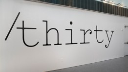
The Herb Lubalin Study Center of Design and Typography marks its 30th anniversary with an exhibition entitled Thirty: 1985-2015. The show, which opens on September 11 and closes on October 3, leverages the Center’s unparalleled collection of more than 50,000 pieces of design ephemera to tell the story of its exhibitions, publications, talks and most importantly, its archive.
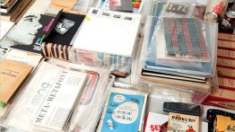
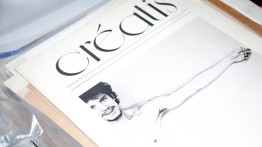
Some of the highlights of the collection on view include World War I-era posters; a signage manual for the New York City transit system by Massimo Vignelli; type specimen books from 1930s Germany; and copies of Idea, an influential Japanese magazine from the 1960s.
Alexander Tochilovsky, curator of the exhibition, says the exhibition conveys the great breadth of the Center’s collection—everything from a 1920s book of etiquette to an early sketch for the MTV logo. “Our archive is the heart of the Center. We regularly see graphic designers come in looking for inspiration from the collection, and we want to get the word out that it can be useful for all types of researchers—artists, writers and historians.” To that end, he has designed the show to recreate the archive and give visitors the feel of conducting research there: six flat-files filled with notable pieces from the collection sit at the center of the main gallery.
One wall of the 41 Cooper Square Gallery will showcase 30 posters from the collection. “I want people to be surprised by the scope of what we have,” Mr. Tochilovsky said. “And perhaps to also be surprised by posters that they may not have seen before, to see ones that aren't that famous, but are stunning posters nonetheless.” A psychedelic poster by famed alumnus Victor Moscoso will be on exhibit as will a gorgeous Swiss Air advertisement from 1972, an aerial view of skiers.
Since its start, the Lubalin Center has presented 71 exhibitions. Visitors can peruse catalogs from the shows, which hit on the many ways that graphic design is integral to modern life. From an examination of hand bills and advertisements of the pharmaceutical and patent medicine industries (“Pharma,” 2011) to an exhibition about the evolution and role of Blackletter script and type, a style of typography distinguished by its dark, heavy appearance (“Black Letter: Type and National Identity,” 1997).
Connecting contemporary practice to historic examples of graphic work, Mr. Tochilovsky has invited 30 critics and artists to each write about one item from the collection, a section of the exhibition, called 30/30. Guests include Jessica Helfand, a co-founder of Design Observer, who comments on a print ad for CBS by Lou Dorfsman. The ad, which sets out to gloat on the broadcaster’s unexpected success with its comedy shows, features the word “ha” written three times in a black, hand-drawn font, each “ha” growing progressively bigger. It uses font, color and size to convey a bit of playful swagger. Abbott Miller, a partner Pentagram and a 1985 Cooper Union graduate, weighs in on three New York Times ads, praising the subtle craftsmanship of the layout, the copy and the photography by Robert Frank. Two early 1960s covers of the short-lived magazine, Monocle, will be on view with commentary by Steven Heller who sees in the woodcut, Americana aesthetic used by art director Phil Gips—a refreshing response to the coolness of the Swiss style.
The Center was founded in 1985 by a group of Herb Lubalin’s friends and family to honor his work as one of the most influential graphic designers of his time. Besides original tissues of Lubalin’s work and his extensive collection of graphically significant magazines, posters, stationery, advertising magazines and books, the archive includes the collection of Lubalin’s friend and business partner, Aaron Burns, a type legend known for championing new typefaces and protecting the rights of their designers. The Center’s founding manifesto, which will be on exhibit, vowed that the Center would “promote the history and practice of graphic design,” predicting that the future of the field depended on embracing technology and “avoiding Luddite alienation from industry,” as its authors, George Sadek, the Center’s first director, and Ellen Lupton, its first curator, put it. Sadek, a designer and educator who adeptly highlighted the exceptional contents of the archive, understood the possibilities and perils of desktop publishing that made a universe of fonts so readily available to the public. The catalog of an exhibition dedicated to his work will be featured in the Lubalin 30 show.
One part of the exhibition is dedicated to Lubalin’s exuberant and influential work. His daring and innovation reflected the tumult and excitement of mid-20th century American life. A 1939 graduate of The Cooper Union in art, Lubalin started his career in advertising at Sudler & Hennessey, eventually becoming a partner in the firm and creative director of the company’s design division. He founded his own firm in 1964, and with his frequent collaborator, publisher Ralph Ginzburg, put out magazines that explored changing sexual mores and political hypocrisy while providing irreverent takes on popular figures. Lubalin, who was the creator of the Avant Garde typeface and a co-founder of the International Typeface Corporation, captured the counter culture’s ethos of freewheeling experimentation and greatly influenced the aesthetics of better-known publications such as Rolling Stone.
In the future, Tochilovsky hopes that the collection will have greater representation of female designers. “It’s one of the goals of the exhibition—to generate more interest among young designers and eventually to expand our collection.”

