Senior Snapshots: Art 2019
POSTED ON: May 1, 2019

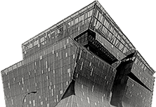
Andrés Sotelo, Seeker, 2019; Pipe, 2018.

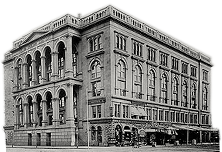
Andrés Sotelo, poster for his senior show 'Salvage,' 2019; Paint on handmade paper, 2019.

Jhakai Deshong, Untitled, 2018.

Jhakai Deshong, Untitled, 2019.

Jhakai Deshong, Untitled, 2019.

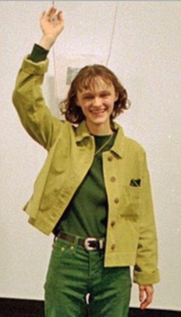
Isabella De Matteo, tlercast!, 2019.

Isabella De Matteo, Something For E V E R Y O N E, 2019.

Isabella De Matteo, detail from her show "winsomeloving," 2019.
Each year the communications office, in tandem with the deans of each school, select a few members of the graduating class to profile. This year's first installment focuses on three seniors in the School of Art: Andrés Sotelo, Jhakai Deshong, and Isabella De Matteo.
 At his parents’ record store in Corona, Queens, Andrés Sotelo studied the posters announcing an impending concert for one of dozens of visiting sonideros, deejays from Mexico City. But it wasn’t the music that intrigued Andres so much as the letterforms deployed by the posters’ designers. How was it that a font could act like a fingerprint, packed with a culture’s typeface DNA? Those questions were equally potent outside of confines of the family record store. The graffiti of Corona posed similar mysteries: how far could you play with the shape of an A, say, before it was no longer legible? Is legibility overrated? Can an illegible script convey meaning too?
Typefaces—using existing ones and designing one of his own—is at the heart of his art practice. He titled his senior show “Salvage” seeing it as a word that implies collage, as in, he pieces together his artistic identity from a myriad of sources: his neighborhood, Puebla (his parents’ hometown in Mexico), Mayan drawings, as well as the Swiss-based aesthetic of Modernist type design.
Despite his fascination with type since childhood his path wasn’t always clear. On two occasions, his guidance counselor at High School for Arts and Business in Queens, suggested he quit school. “I was too busy thinking about letterforms and wasn’t doing well in school.”
Andrés ignored the inept advice of the counselor and earned his high school degree while still pursuing his love of letters and the medium of signs. “Letterforms are how I think. Letters and type set the tone for a project.” Although he sees art as a method for communication, he doesn’t think that presenting a message directly is always the best strategy. A case in point is a piece centered on an expression his grandmother used, “El que busca, encuentra,” that is, “One who seeks, finds.” Suiting that theme, he devised lettering built on geometric forms that need to be studied before the message can be deciphered.
Smitten with the beauty of imperfection, he has also been making his own paper and then painting the bottom edges. “The paint is there to show the paper as an object. The paint sits on top and lets you appreciate the inconsistencies of the paper. He decided on a particular color palette similar to the one used for his senior show poster, which he designed on the computer. “It came from wanting to make analog versions of digital work,” he says.
After high school he worked at a restaurant for four years, seriously considering going to culinary school. Instead he enrolled at the Borough of Manhattan Community College to study graphic and web for three semesters, before transferring to Cooper. The transition to Cooper was tough: not only was he suddenly in a much smaller, more specialized institution but he was at least five years older than most of his classmates. “It was a difficult first year, but my teachers here have been extremely supportive. They help us get to where we want to be.”
Andrés has made a point of taking at least one class a semester that required working by hand. For one of those classes, relief printmaking, the professor, Sasha Tochilovsky, challenged students to design a piece using a reviled typeface. Andrés chose the much-maligned Comic Sans and used it to reflect on The Cooper Union’s recent history—the struggle to maintain its identity while charging tuition. Capitalizing on the font’s rounded edges, Andres arranged letters to look like a chain with one link comprised of a C and a U uncoupled, the U falling off the edge of the page.
While studying, he has worked at Almond, a restaurant near the Flatiron, in various positions, most recently as a food runner, expeditor, and manager. “I love learning about food and learning the history of the dish, the palette of dishes, the colors. So at my restaurant, we have a kale dish with chili oil, the greens and purples contrast with a very bright red. The chef has been my mentor for plating. It’s very performative.”
His future ambitions are numerous: while applying for positions at graphic design firms, he plans to keep cooking and learning the restaurant business. His brother is a brewer (he made beer for Andres’s senior show), and the two want to one day collaborate on a brewery specializing in beers with Mexican ingredients; naturally, Andres would be art director, creating the brewery’s design identity. He also plans to eventually start his own graphic design firm and offer free workshops for high school students, inspired by his time teaching typography to high school students in Cooper’s Saturday Program .
“Teaching graphics to New York City public school students for Cooper’s Saturday Program taught me a lot, as a student, professional, artist, and as someone who also went through the public school system in New York. I want to create more spaces for them to work, experiment, and learn.”
 One of the hallmarks of an education in Cooper’s School of Art is the self-driven curriculum: students are propelled by their passion and make art in whatever direction that takes them. In the case of Jhakai Deshong, writing has become as central to his art practice as photography, painting, and performance. That combination has been brewing for quite a while—at times unbeknownst to Jhakai himself. “I studied oil painting at LaGuardia,” he says, referring to the famous New York City high school for the arts. “But a lot of my friends were musicians. I didn’t realize then how much they influenced me.
But by the time of his senior show in April, that confluence of artistic forms was on view. The opening featured the artist performing his story “Boy’s on the Porch,” a first-person narrative that describes “Boy,” a figure whose identity isn’t readily explained but whose outsized influence on the narrator is apparent. For the performance, Jhakai created a sparse set on the second floor of the Foundation Building comprised of an armchair, a Persian rug, an overturned chair, several of his photographs, and a framed, enlarged page from the story. Done in two parts, the performance is not so much an “acting out” of “Boy’s on the Porch” as an expansion of it using music, poetry, dance, and lighting design. He used repeated words and expressions to form a soundscape of the character’s mind, phrases meaningful to him but opaque to the audience. Jhakai says he struggles to make art reliant upon personal touchstones that, at the same time, communicate to a larger public. His “Boy’s on the Porch” performance was assured and mysterious at once, managing to convey the inner life of a figure transitioning to adulthood and very much alive to its possibilities.
The driving force of Jhakai's art is what he calls “a set of politics that are urgent.” As a result, a lot of his practice wrestles with the abstract language used to discuss notions of race and gender. He aims to reimagine that discourse, using literature and storytelling as a means for making the discussion accessible to his audience.
Jhakai's senior show was not his first exhibition this year: in March, he curated “And Then Some,” a show dedicated to the art of women of color studying at Cooper. Only after extensive conversation with the artists was he able to discern a way to organize the exhibition, one that revealed multiple narratives in their work. He says, “Each piece acted as a visual map that contained and preserved a multiplicity of routes and stages. In this way it exceeded any assumption that there is a legible route, or a clear path to the figure being represented.”
Jhakai, who grew up in the East Tremont section of the Bronx, was immersed in art in his home thanks to his father’s love for illustration, comic books, and poster art, especially for old movies. An illustrator himself, Jhakai’s dad is obsessed with visual storytelling. He was the person who first told his son about The Cooper Union. In Jhakai’s four years at the school, it’s clear that he’s inherited the family love of storytelling, so much so that in 2018 he published his first book, Letters for the Wrist. An epistlolary novel, it dramatizes a central figure’s relationship to a set of correspondents again using language that, while initially obscure and fragmentary, builds meaning and emotion over time. Not surprisingly, the act of making visual art makes an appearance in his written work, as in this excerpt from the novel: "The lines that they drew were not my lines. The lines they drew were thicker. Better. Drawn more quicker. I laughed while I drew mine. I was slow. I broke the end where the line was supposed to stop, and kept it going. I drew it over things not meant for me. I drew the line over their pride. Split the thing into two, and then moved on. I drew the line over their pity. Split the thing into two and laughed while I drew."
After four years of deadlines at Cooper, Jhakai’s looking forward to some unstructured time. He says, “I am mainly excited to have some time and space for myself to continue to explore more deeply several of the mediums and traditions I am using and coming from: music, photography, and literature."
 Isabella De Matteo often makes art work on a small scale, which makes sense considering her fascination with objects both tiny and portable. They can hide in plain sight as those we take for granted—our keychains and coins—or they can be back pocket amulets shot through with meaning. That interest didn’t always make for an easy time during her first years at Cooper where she often received crits that essentially gave her a vexing message: Go big. But with the support of some colleagues and faculty, most notably professors Will Villalongo and Oscar Cornejo, she’s been able to concentrate on the everyday matter that fuels her art practice.
A native of Huntington, Long Island, Isabella learned about Cooper through her father, a lieutenant in the New York Fire Department. Her mother, who studied art history, devised creative games for her children and encouraged them to make art. In fact, one of Isabella’s favorite pieces in her senior show is a photograph of her mother, her twin sister, and herself playing with ribbons as their mother looks on. The photo is embedded in paper that Isabella made and was set between two chains made of copper and aluminum of various colors. “I realized that I didn’t have to put photos on top of the paper but could make them a part of the paper itself.”
Another discovery made during the show: she can direct her audience’s path of movement and encourage them to touch her work by making particular installation decisions. In one case, she hung about 38 keychains she’d made from the ceiling, dangling them at different heights. “I saw that people were much more willing to touch them because they were suspended than if I’d hung them against the wall. I liked that.” She chose to make key chains because of their banality, the sort of object we depend upon but barely notice. Her goal was to make the everyday more visible to her audience, something akin to The Gates, a 2005 Central Park installation by Christo and Jeanne-Claude. Isabella recalls her mother taking her to see the 7,500 orange flags that traced 23 miles of the park’s contours.
The keychains are part of her interest in collections, why and what people choose to collect and how they display them. She has made a series of rubbings of the 50 State Quarters, coins that the U.S. Mint released between 1999 and 2008. She recalls people collected them while she was in grade school and is struck that her friends, knowing about the rubbings, often give her quarters they’ve come across, thinking she’d like to have them. She views such gifts as minor triumphs: her work caused her friends to pay attention to something commonplace, which is, in many ways, the goal of her practice. Isabella makes other rubbings reminiscent of another pocket charm once ubiquitous as an advertising giveaway—pennies encased in a metal frame embossed with a saying: “Keep me and never go broke” or “Vote for Leon Lomax for mayor.” In Isabella’s rendition, she condensed the phrase to good luck with an image of a shooting star, a symbol of fortune frequently used on the metal frames of encased pennies. The piece, entitled “Good Luck (Wendy’s Birthday)” is a graphite drawing with elements of kozo/mulberry papers and an inkjet print; at its center, instead of a penny, is a photograph of a birthday cake.
Isabella doesn’t feel a particular affinity for any one art form—she paints, draws, and sculpts, and in the summer she plans to learn ceramics or glassblowing as a fellow at the Ox-Bow School of Art. A program associated with the Art Institute of Chicago, the Ox-Bow School is in western Michigan. It gives fellows studio space, a chance to take one class, and to act as a staff member assisting visiting artists. Besides the art-making skills she’s learned at Cooper, she’ll bring to Michigan a certainty about her work’s ability to make an impact on an audience no matter its physical size: “It’s there for everyone that wants to listen,” she says, everyone who wants to take the time to notice.